A little message is always nice 😊
I will help you achieve your goals 🎯
You want to know my methodology ?


* User Interface and User Experience
** Content Management System


Max and I worked together for five days onsite. We set out to complete seventeen screens and five userflows; we completed 46 screens, three overlays, and had a deep, functional prototype by the time we finished the project. Max was professional and efficient, communicative, and very responsive; his English is functionally perfect. Working with him was easy, and obviously very productive. I intend to work with Max whenever possible in future, and I would confidently recommend working with him to anyone who asked.

As a developer I worked in collaboration with Max to design and implement the graphic overlay of a communication application. After a real research work to better understand the needs and adapt them to future users, he offered us a global structure of the application. We were thus able to project ourselves and refine certain choices. Finally, he shared with us the final models corresponding to what we had concluded. The modernism of the visuals and the user facilities linked to the UX pleased us a lot, moreover the tools with which he works gave us real help for the integration of these models. We will be happy to work with him again on other projects, thank you again!

I had the opportunity to use Max’s services to create my Marketplace. He is a very professional person, who listens and is very reactive. He also showed initiative and creativity… I am very satisfied with his service.

I’ve seen a lot of meat sites, but I never imagined it could be so clean.

Working with Max Beaubois was an incredibly positive experience! His creativity, expertise in UX design, and mastery of Figma were key to the success of our project. I was impressed by his ability to understand and perfectly meet our needs while contributing insightful ideas.
I highly recommend him for any web or mobile design project!

Max met most of our expectations. He is a pleasant and responsive service provider who always meets deadlines. He brought the web design touch we were missing.

Max was extremely professional and efficient from start to finish on the project. He understood our challenges and adapted his approach to accommodate our constraints, delivering excellent results both in terms of the substance and the design of the web project. He also created our design system following our guidelines and provided a highly satisfying outcome. We recommend him 100%!
Max impressed us with his ability to quickly grasp the complexities of our niche industry and deliver a modern, user-friendly design. His speed and professionalism were beyond what we expected, and the new interface has been enthusiastically received by our users. We couldn’t be happier with his work!
Myself
Myself
CEO, founder, UI/UX Designer, branding
Design and user experience development for SpiriGuide, an innovative app combining AI insights and expert advice to provide personalized spiritual guidance.
After substantial quantitative and qualitative market research, I realized that the the spiritual community lacked a centralized platform that offered holistic and personalized guidance.
Existing solutions were fragmented, poorly designed, and failed to meet the diverse needs of users. I decided to launch SpiriGuide to fill this gap by delivering a seamless, user-friendly experience that balanced AI support with human expertise, and answers several needs of the community.
Spiritual people feel lonely in their journey, and are looking for a community of like-minded people
There is too much information and concepts. They lack a structure and direction to explore their spirituality
They struggle to be consistent in their spiritual practice
They search for a deeper meaning in their life
An app that leverages AI to guide you to the right resources, combining that with real human guidance and a community.
This was the major challenge for this project: AI can help the community like never before, but they are allergic to it!
I answered this challenge by creating Spiri, the AI mascot. Thanks to Spiri, it takes pressure off AI and makes it more alive and friendly.
The design required integrating AI recommendations seamlessly with human input. I focused on creating clear pathways for users to access personalized insights while connecting them to relevant resources and practitioners.
The app revolves around its chat interface, where Spiri takes life with animations. Everything starts here, ask Spiri any question


All resources are gathered in one tab for easy navigation
Under the community tab, you can find different news and discussions channels, chat and like-minded people near you


The AI suggests experts to have consultations with when relevant. This way the loop is closed with guidance that starts with AI, resources and human guidance if necessary
In order the make the app more engaging and user friendly, I have introduced a gamification system. Where each time the user completes a resources, he earns 1 gem, gems then unlock new labels and possibly prizes !

Lorem ipsum dolor sit amet, consectetur adipiscing elit. Ut elit tellus, luctus nec ullamcorper mattis, pulvinar dapibus leo.


For a French startup
UI/UX Designer
For a French startup
UI/UX Designer
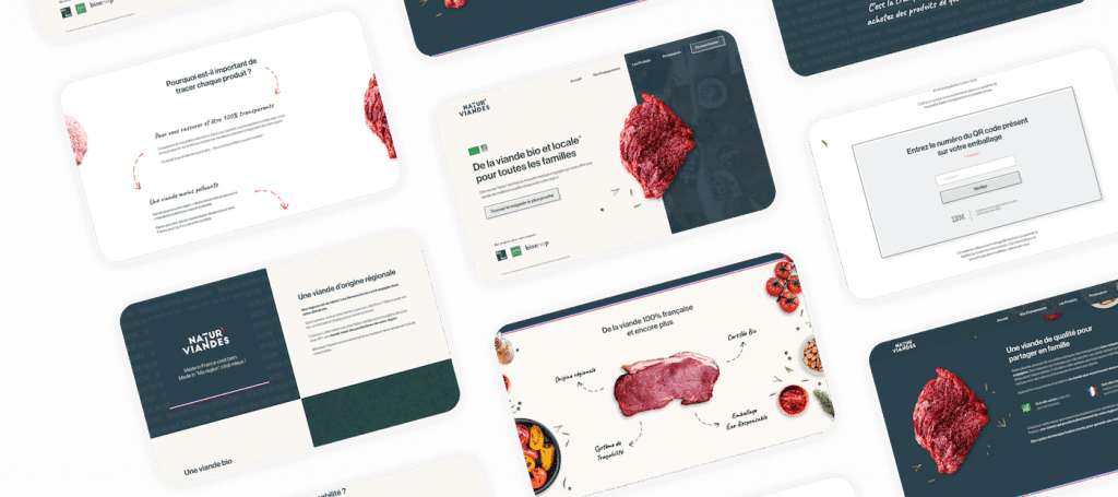
The organic meat market is very limited in France, the majority comes from Argentina, so it is organic, but not local nor ecological. Natur’Viandes offers a solution to this problem: Organic AND local meat, by establishing itself in each region of France.
For this mission, I worked in collaboration with a freelance colleague specialized in marketing and integration. Currently, the site integration is not yet complete as the client has been delayed due to the pandemic.
3 modern sites to be created to effectively convince 3 different clienteles.
Effectively communicate the organic and local aspect of the brand.
With limitation due to the elements provided at the start: Logos and packaging.
3 modern sites to be created to effectively convince 3 different clienteles.
Effectively communicate the organic and local aspect of the brand.
With limitation due to the elements provided at the start: Logos and packaging.

The client was working with a branding agency that produced the following logos.
So I was restricted to these colors and typography for the site.
Part 1
3 sites have been created, to simplify I will only talk about Natur’Viandes and will also mention Saveurs de nos Prés.
The market study was already done by the founder when I arrived, here is what was indicated to us following the explanations and in response to our questions:
From this target market I created several personas, here are the two main ones :
Claire is a mother of two children. A few years ago, she researched nutrition and products sold in supermarkets. She is therefore careful about what she eats and especially what she gives to her children. Today she mainly does her shopping in organic stores and completes them in supermarkets.
What she is looking for :
Alex is a 28-year-old, he does his grocery shopping like everyone else, but he really likes quality meat and would like to eat more locally, which is often lacking in this kind of store.
What he is looking for :
We put ourselves in the mind of a consumer, and visited the competition to understand the issues in the field, compile the strengths and weaknesses of competitors’ sites and extrapolate the best approach to stand out.
Following this competitive analysis, we had the idea to stand out by creating a real experience when visiting the site, so that the visitor associates the brand with an up-to-date company, which fits perfectly with Natur’Viandes, because they use the latest technologies (blockchain, sensors, e-commerce).
Part 2
It’s time to design!
Once we figured out who our audience was, I pulled out the pencil to draw the wireframes (low-fidelity mockups) on paper.
I then started to look for inspiration on the web and to create the first model, that of the homepage, and define the colors and the typography.
Still restricted by the logo, I used its colors that I contrasted with a cream background, which recalls the eco-responsible side.
I also used blue in the background to contrast with the beige and bring more character to the brand.
I combined an angular font to stick to the logo with a handwritten font to contrast and bring a family-friendly touch.

Adobe

Google Fonts
I decided to integrate the pieces of meat directly into the design, as opposed to adding a photo.
This is the centerpiece of this design when it arrives on site. That way, we understand that we are on the site of a butcher shop, which is crucial to the UX.


We also have another section with animated butcher style arrows listing selling points.
As with the meat, I incorporated vegetables and condiments on the page, I was careful to arrange them in a way that complimented the meat without them taking over.
I emphasized the local aspect by integrating accents of french colors throughout the site. Also the mention “Made in ma région” very telling that I took in stylized background.


I’ve seen a lot of meat sites, but I never imagined it could be so clean.
Emmanuel VILBRUN - Founder of Natur’Viandes
Currently, the site integration is not yet complete as the client has been delayed due to COVID-19.
On the other hand, we have the idea of displaying the packaged meat with an animation on scrolling the mouse that will take the meat out, and display it without the packaging. This will add an unboxing experience and make the site even more interactive. Not to mention the WOW effect!

For an English startup
For an English startup
UI/UX Designer
The average weekend trip takes 15 hours to plan, and the reason it takes too long is because you’re working across different types of sources, none of which are credible, up to date and tailored to you.
The objective of the first mission was to create a first prototype of the application to present to investors as part of a fundraiser.
My intervention lasted 5 full-time days, with the initial objective of 17 models, we produced 49 after these 5 days, and a great improvement in the user experience. Well above the initial objective 🙌
Part 1

The structure has also changed, instead of having 4 different possible elements, we have reduced it to 3 to simplify the understanding of the application.
The homepage was set to the “Hub” of the application. But this posed some problems :
The single card problem was :

The Solution : Hybrid
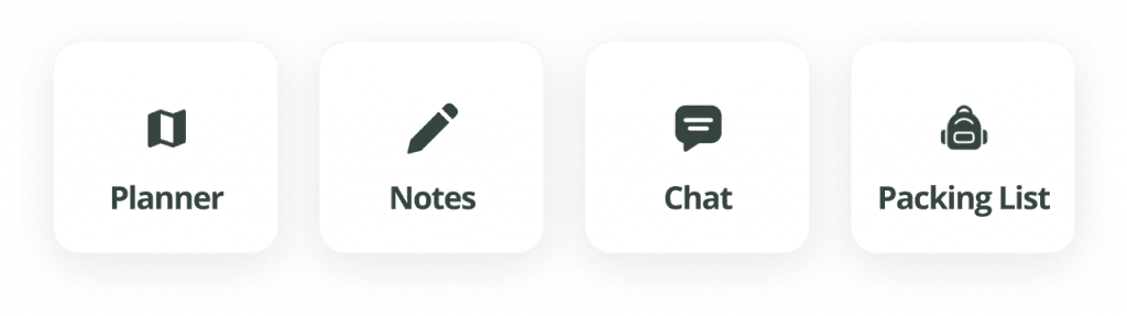
with the map and a window to search for interesting places and with quick access to the current trip.
Part 2
As explained previously, the landing page is a map with a window allowing you to browse the recommendations and quickly access the current trip.


The travel page brings together all the information needed to plan a trip alone or with others:


Scott Bedard
Guidebook CEO & Founder
Max and I worked together for five days onsite. We set out to complete seventeen screens and five userflows; we completed 46 screens, three overlays, and had a deep, functional prototype by the time we finished the project. Max was professional and efficient, communicative, and very responsive; his English is functionally perfect. Working with him was easy, and obviously very productive. I intend to work with Max whenever possible in future, and I would confidently recommend working with him to anyone who asked.
For a French startup
For a French startup
UI/UX & logo Designer
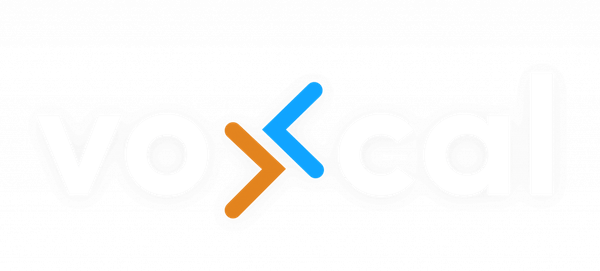
The company behind Voxcal, SCEP, is a cooperative company, made up of developers who had the project of creating a French professional communication platform. Unlike similar apps like Slack or Microsoft Teams which are American giants.
Redesign of the application for a more modern image and a better UX.

Part 1
We sent a form to the future testers of the app to have an idea what our audience was
20-29
30-39
40-49
50-59
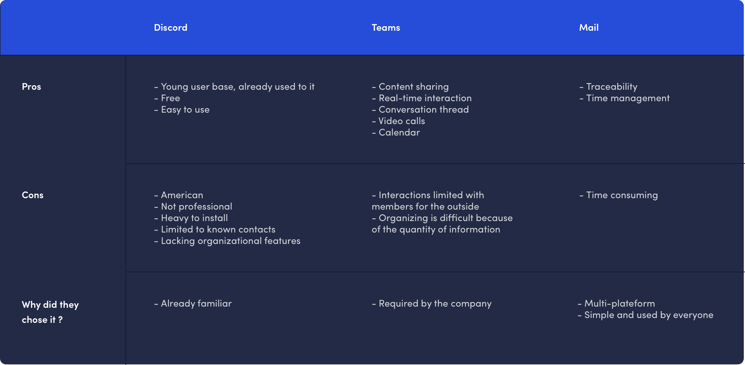
Discord
Teams
From this information, I compiled personas:

26 years old
Victor, 26, is a Programming Engineer, he generally uses Discord to communicate with his team because he is used to using it, and finds the application easy to use.
However, he would like to use a more professional and faster application, with more organization options and the ability to communicate with non-registered users on Discord.

52 years old
Étienne 52 years old is Commercial Director, he interacts frequently with new contacts. He generally uses Microsoft Teams, because he finds the application simple and it allows him to interact in real time in a conversation thread or even integrated videoconference.
Due to the amount of messages he receives, he is sometimes overwhelmed, and the platform becomes confusing. He therefore expects his future tool to allow organizing information very easily. But also the ability to communicate with people off the platform.

50 years old
Robert 50 years old is an engineer, he generally communicates via email, because it is a simple, traceable option (he can easily find past conversations), and he manages his time more easily. It also allows him to communicate with anyone from any platform.
Following user research, we have defined the points to highlight in our offer :
1. Speed of use, quick actions and simplicity
2. Quick to learn for mail and Discord users.
3. Cross-platform
4. Features for professionals :
– Saving chat messages and archiving
– Screen sharing
– Transfer of messages (forward)
5. Opensource
6. Confidentiality and French
Proposals that differentiate us from competitors
Part 2
Reorganization of the architecture
A big issue that the pre-alpha version brought to mind for me was the architecture of the application. In particular, we had 3 separate types of conversations, with different terms for each, which from a UX point of view is bad. So I gathered what I could, and I gave consistent labels through the app.
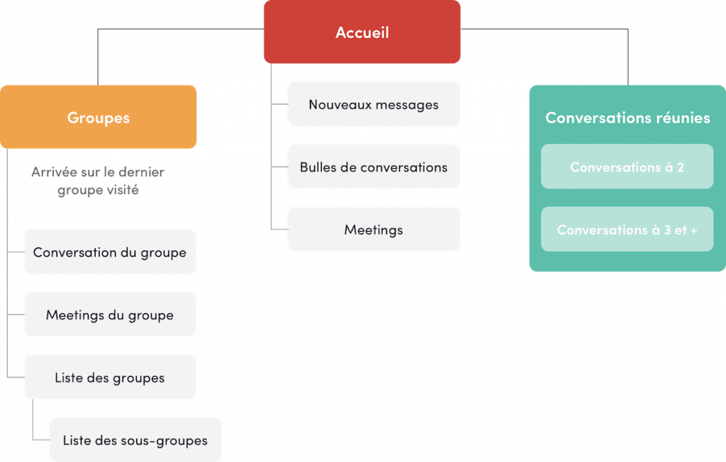
Once the architecture was renovated, I started creating wireframes to define the placement of all the elements on the screen.

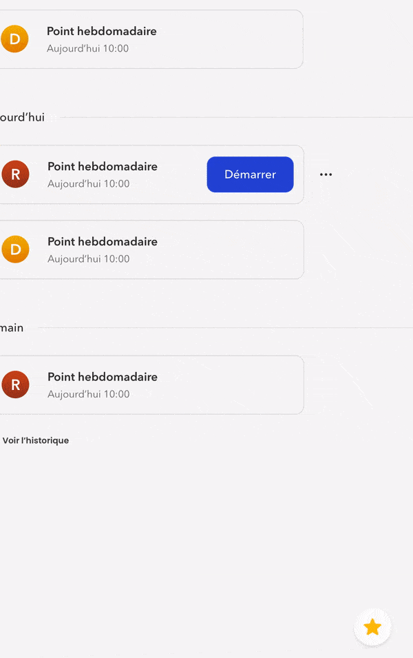
I’ve expanded all the components for better readability, removed what wasn’t useful (favorites and welcome message), highlighted new posts as that’s the first thing users need to see, and meetings too, but second.
Favourite conversation bubbles are present at all times at the bottom left, with the option to retract them if they hide content.
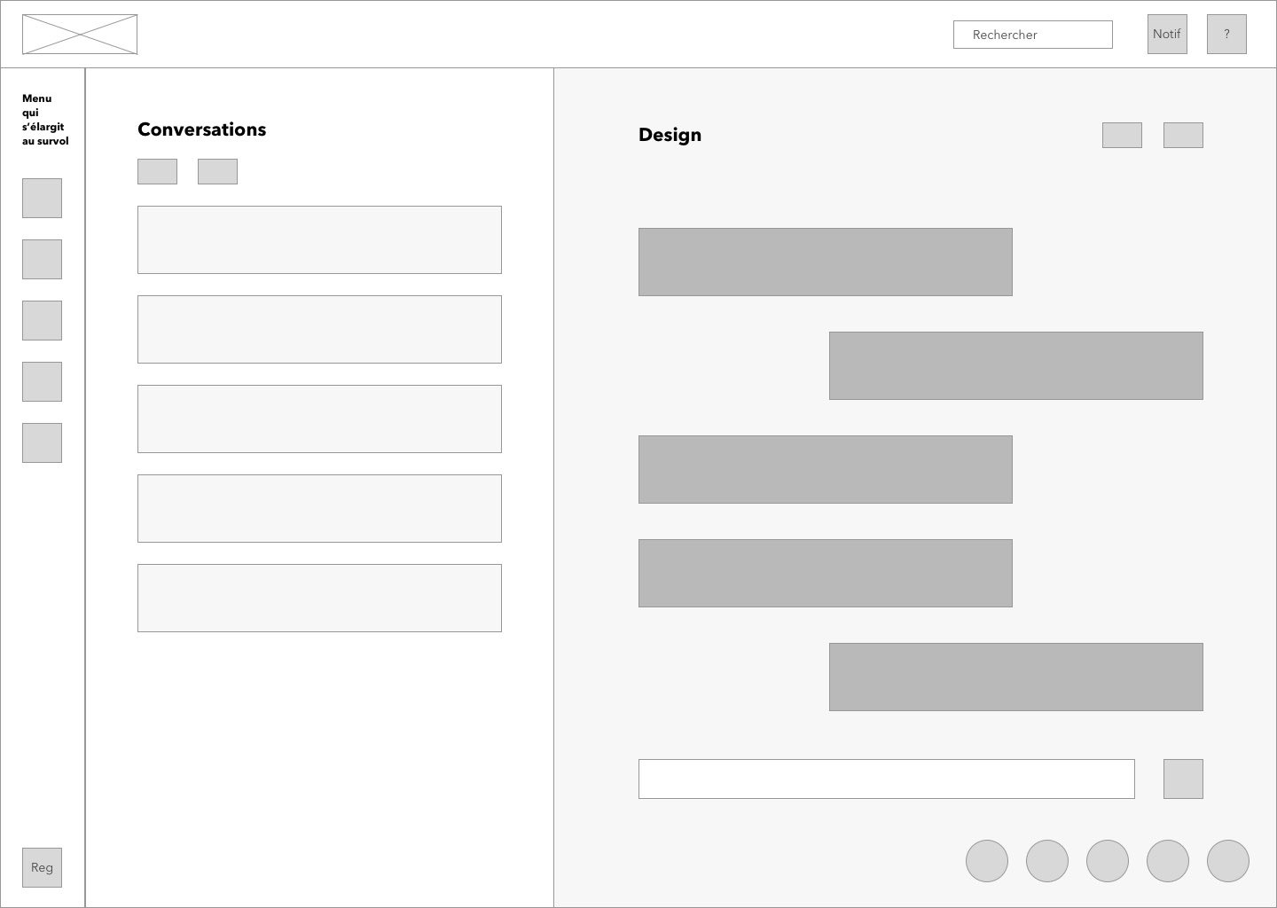
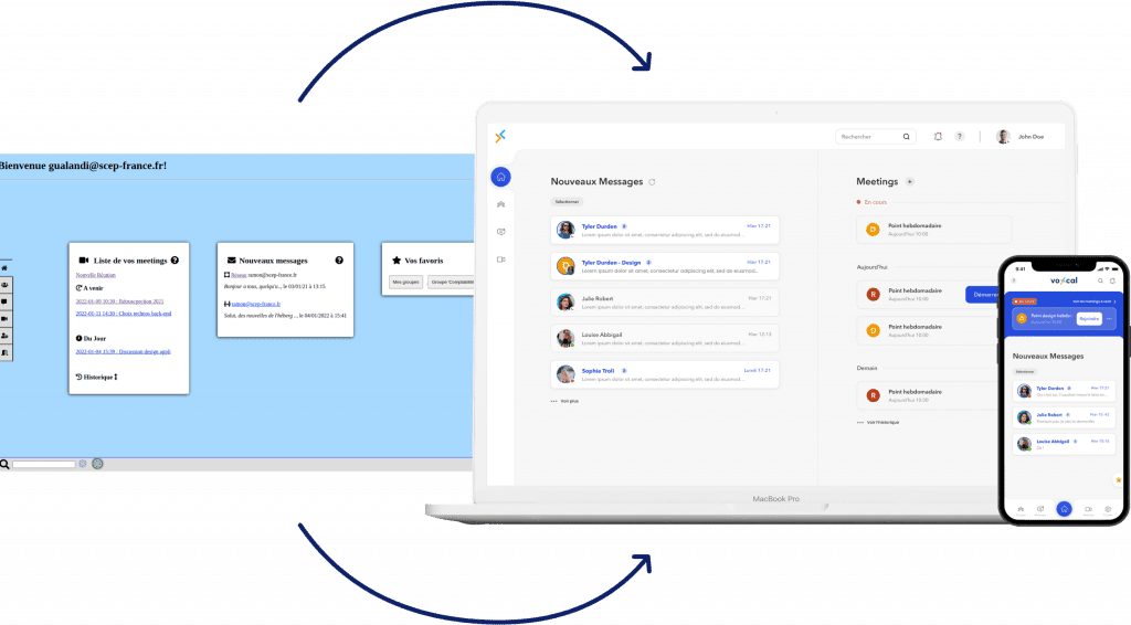
The conversation page is composed of two parts, with the list of conversations on the left, and the selected conversation on the right.
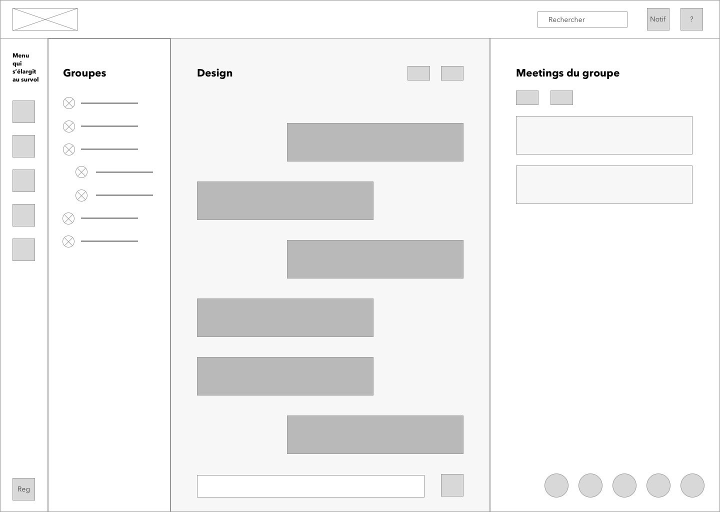
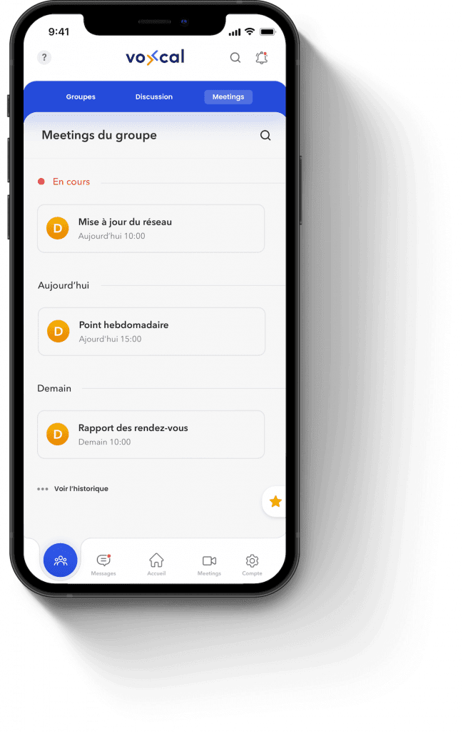
The group page is more complex, because there is a lot of information. Nevertheless, I managed to display everything clearly, inspired by the discord groups.
The page is composed of 3 parts: on the left the list of groups sub-groups of the company, as on discord. With the conversation of the selected group in the central part. On the right are the meetings specific to the group.
Part 3
Although this is not my field of expertise, I had to adapt by creating this logo and graphic charter. They wanted the logo to respect the color sky blue and orange, colors that are relatively difficult to combine, but the end result is there.
Dark Blue
Use
Text
Hex
#0F226A
RGB
rgb(13, 32, 110)
Sky Blue
Use
Contrast and lighten
Hex
#00A5FF
RGB
rgb(0, 166, 255)
Orange
Use
Accent
Hex
#E3841F
RGB
rgb(241, 127, 0)
Finally I started to create design elements, then the models from the wireframes.


Then, I adapted the design to a mobile version, the challenge at this stage was to provide all the functionalities of the application while keeping it as refined and intuitive as possible.
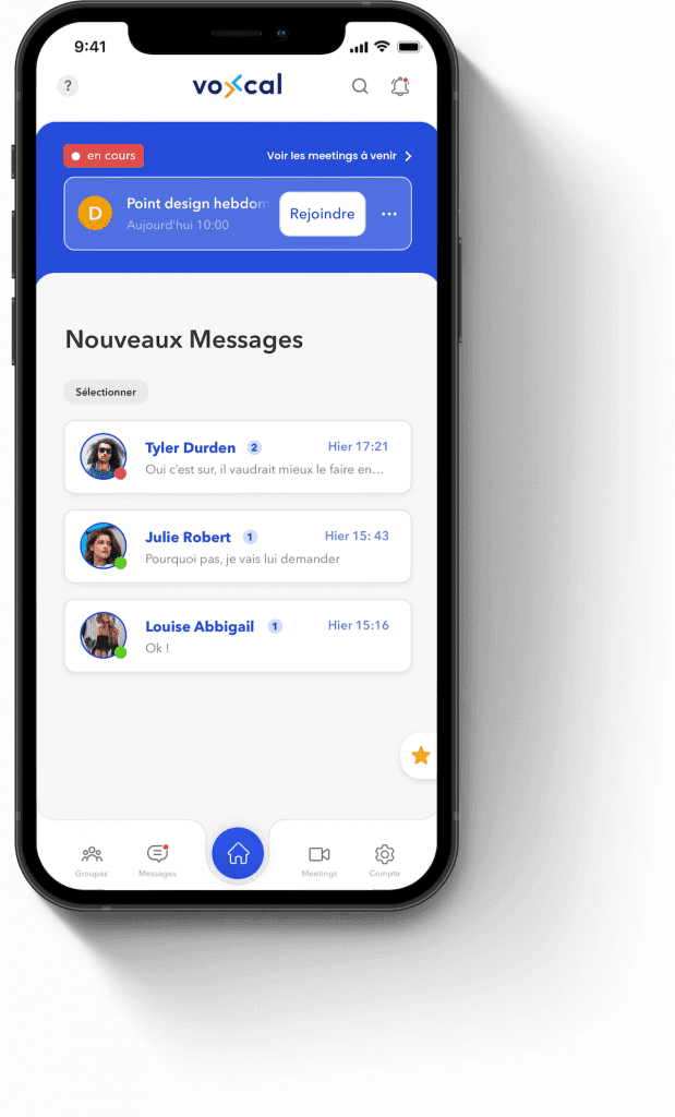
For the home page, I used scrolling only to see the posts, because that’s the most important thing.
But in order not to ignore the meetings, I highlighted the next meeting (or in progress, if there is one), with the possibility of seeing all the meetings to come.
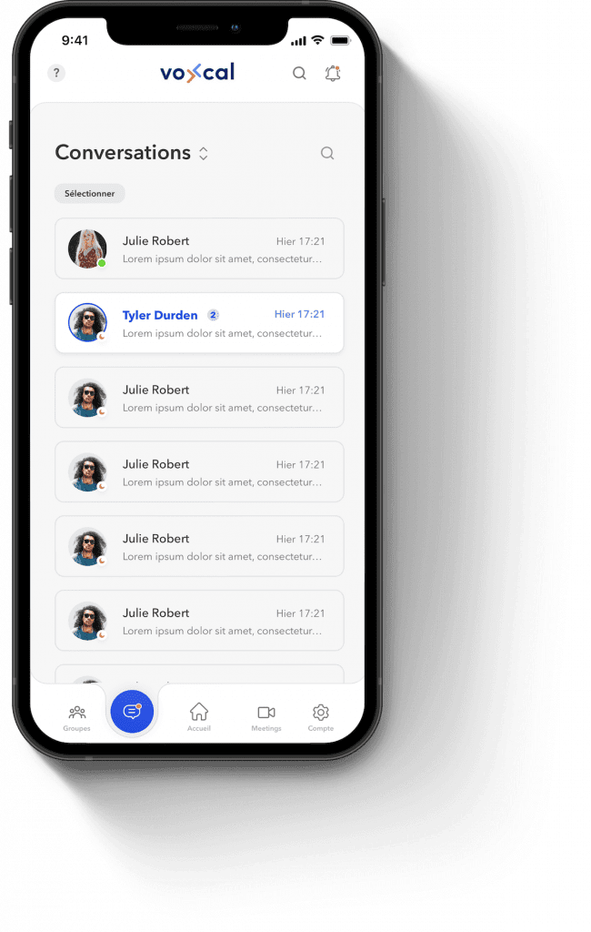
For the conversations page, I went with a conventional solution, such as Telegram, Messenger or WhatsApp. With the list of conversations.
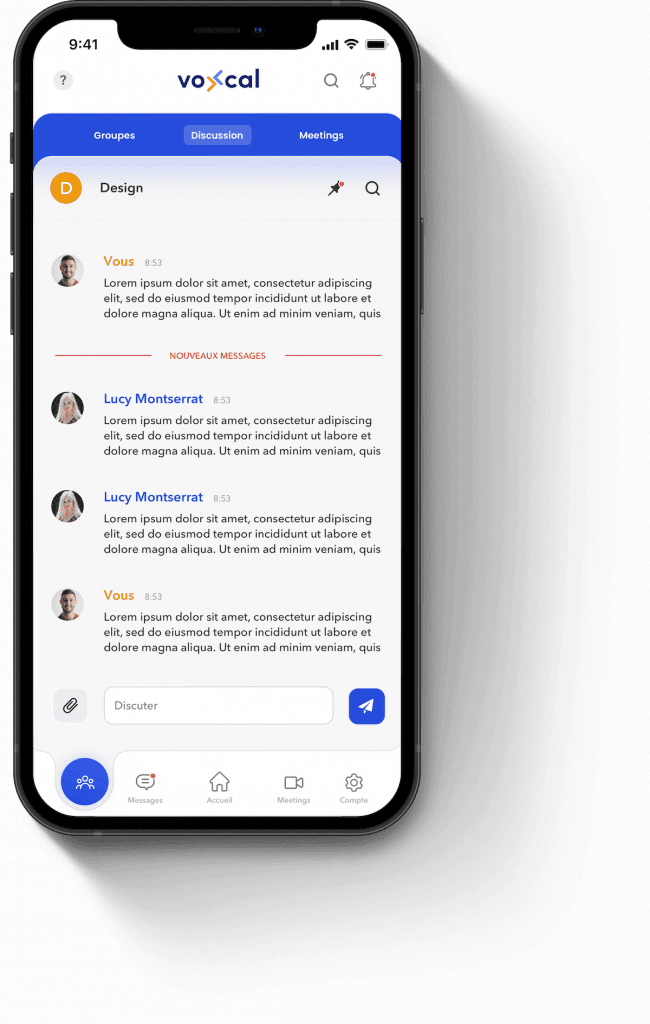
For the groups page, the desktop version had a lot of information, so it had to be organized.
The most important being the conversation, we get there by default.
After several tests I opted for a system of tabs to navigate between the discussion, the group meetings and the list of groups.


Stefan GUALANDI
Web developer at SCEP
As a developer I worked in collaboration with Max to design and implement the graphic overlay of a communication application. After a real research work to better understand the needs and adapt them to future users, he offered us a global structure of the application. We were thus able to project ourselves and refine certain choices. Finally, he shared with us the final models corresponding to what we had concluded. The modernism of the visuals and the user facilities linked to the UX pleased us a lot, moreover the tools with which he works gave us real help for the integration of these models. We will be happy to work with him again on other projects, thank you again!
Pour une startup Française
UI/UX Designer
Pour une startup Française
UI/UX Designer
Le marché de la viande bio est très limité en France, la majorité provient d’Argentine, donc elle est bio, mais pas locale ni écologique. Natur’Viandes propose une solution à ce problème : Une viande bio ET locale, en s’établissant dans chaque région de France.
Pour cette mission, j’ai travaillé en collaboration avec un collègue freelance spécialisé dans le marketing et l’intégration. À l’heure actuelle, l’intégration du site n’est pas encore terminée car le client a pris du retard à cause de la pandémie.
Communiquer efficacement l’aspect bio et local de la marque.
Avec limitation due aux éléments fournis au départ : Logos et packaging.
3 sites modernes à créer pour convaincre efficacement
3 clientèles différentes.
Communiquer efficacement l’aspect bio et local de la marque.
Avec limitation due aux éléments fournis au départ : Logos et packaging.
Le client travaillait avec une agence de branding qui a réalisé les logos suivants.
J’ai donc été restreint à ces couleurs et typographie pour le site.
Partie 1
3 sites ont été réalisés, pour simplifier je ne parlerai que de Natur’Viandes et mentionnerai aussi Saveurs de nos Prés.
L’étude de marché était déjà faite par le fondateur à mon arrivée, voici ce qui nous était indiqué suite aux explications et en réponse à nos questions :
À partir de ce marché cible j’ai créé plusieurs personnas, voici les deux principaux :
Claire est mère de deux enfants. Il y a quelques années, elle a fait des recherches sur la nutrition et les produits vendus en supermarché. Elle fait donc attention à ce qu’elle mange et surtout ce qu’elle donne à ses enfants. Aujourd’hui elle fait principalement ses courses en magasin bio et les complète en grande surface.
Ce qu’elle recherche :
Alex est un jeune de 28 ans, il fait ses courses en grande surface comme tout le monde, mais il aime beaucoup la viande de qualité et souhaiterait consommer plus local, ce qui est souvent manquant dans ce genre de magasins.
Ce qu’il recherche :
Nous nous sommes mis dans la tête d’un consommateur, et avons visité la compétition pour comprendre les enjeux du domaine, compiler les points forts et les points faibles des sites des concurrents et y extrapoler la meilleure approche pour se démarquer.
Suite à cette analyse compétitive, nous avons eu comme idée de se démarquer en créant une véritable expérience lors de la visite du site, pour que le visiteur associe la marque à une entreprise au goût du jour, ce qui colle parfaitement avec Natur’Viandes, car ils utilisent les dernières technologies (blockchain, capteurs, e-commerce).
Partie 2
Il est temps de faire le design !
Une fois que nous avons compris qui était notre public, j’ai sorti le crayon pour dessiner les wireframes (maquettes à basse fidélité) sur papier.
J’ai ensuite commencé à chercher de l’inspiration sur le web et à créer la première maquette, celle de la page d’accueil, et définir les couleurs et la typographie.
Toujours restreint par le logo, j’ai repris ses couleurs que j’ai contrasté avec un fond crème, qui rappelle le coté éco-responsable.
J’ai aussi utilisé le bleu en fond pour contraster avec le beige et apporter plus de caractère à la marque.
J’ai combiné une police carrée pour coller au logo avec une police manuscrite pour contraster et apporter une touche familiale.
Adobe
Google Fonts
J’ai décidé d’intégrer les pièces de viande directement dans le design, contrairement à ajouter une photo.
C’est la pièce maîtresse de ce design à l’arrivée sur le site. De cette manière, on comprend bien qu’on est sur le site d’une boucherie, ce qui est crucial à l’UX.
On a aussi une autre section avec des flèches animées façon bouchère listant les arguments de vente.
Tout comme pour la viande, j’ai intégré des légumes et condiments à la page, j’ai fait attention à les disposer de manière à complimenter la viande sans qu’ils ne prennent le dessus.
J’ai mis l’aspect local en valeur en intégrant des accents des couleurs françaises un peu partout dans le site. Aussi la mention “Made in ma région” très parlante que j’ai repris en fond stylisé.
J’ai vu beaucoup de sites de viandes, mais je n’imaginais pas que ça puisse être aussi propre.
Emmanuel VILBRUN - Fondateur de Natur’Viandes
À l’heure actuelle, l’intégration du site n’est pas encore terminée car le client a été retardé dû à la COVID-19.
En revanche nous avons l’idée d’afficher la viande embalée avec une animation au défilement de la souris qui fera sortir la viande, et l’affichera sans l’emballage. Cela ajoutera une expérience de déballage et rendra le site encore plus intéractif. Sans oublier l’effet WOW !